How to Design Logos, Landing Pages, and Content without Traditional Design Tools, like Photoshop
A former (and incredibly intelligent) colleague of mine recently ventured out to start his own business in the field of machine learning education.
His business is called Viteach and aims to fast-track and personalise the learning of mathematics with the use of machine learning and natural language processing. Even witnessing the application in its infancy I can already tell his concept will take off and become wildly successful.
Anyways, whilst getting things off the ground, he approached me for some design advice. Although I have enough experience designing landing pages and content for my current employer, Homelike, I had never actually designed a landing page for a new business from scratch. So, I decided to give it a go - but where do I start?
My first thoughts were that I would not be able to design anything without photoshop. But, since I didn't have any traditional design program on my computer the question was:
What tool can I use that is both powerful and simple to use, is very flexible (ie. easy to move and manipulate elements, layers, etc.) and doesn't require a paid subscription of any sort?
The answer is, believe it or not, Google Slides.
Why use Google Slides?
Let me just start by saying if you do have Photoshop or another more professional tool at your disposal, by all means, use it. However, for faster turn-around design mock-ups and less hassle with a tool that is free, Google Slides does a marvelous job delivering what you need. Aside from designing Logos and Landing Pages, I also use Google Slides to design downloadable content.
One of the main benefits of using Google Slides for content is that it allows you to share the document with your colleagues and if changes are needed, they can do it themselves. This is opposed to relying on a designer who has limited time, but also the only Photoshop license available in the company to make the edits.
Step 1:
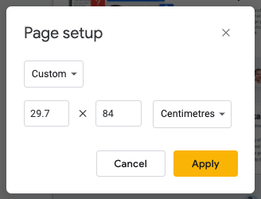
Open a new Google Slide document and change the page setup dimensions to something big enough for a scrollable webpage. I adjusted my page to: 29.7 x 84 cm.

Step 2:
Work out what sections you'll want to include on the page. Just use a text box to type out the hierarchy. Don't worry, it doesn't have to be set in stone the first time - it's just to give you some direction to start.
Step 3:
Use text boxes and adjust the font size and type to get a basic logo prepared. If designing this on Google Slides is too difficult, try using Canva instead.
Step 4:
Start dropping in your content headlines, graphics, icons, etc. If you need some inspiration, check out some landing page design gigs on Fiverr.
Step 5:
Apply some colour and graphic background elements to give your page some diversity and flow. When dropping the images or shapes onto the page, you'll need to change the position (layers) of them so they are placed in the background.
Hot Tip 1:
If your design assets will end up being used for the final output, then I would recommend saving whatever images you use into a folder and upload them into Google Drive to share with the Client once you're done. It'll make it easier for them to leverage the original assets or find similar alternatives when it comes to building the page in HTML and CSS.
Hot Tip 2:
Before you start on a design task like this it's best to ask the client if they have a colour scheme in mind. This will help make your design process more efficient, as you will have all of the necessary HEX codes at hand. If they don't have a colour scheme in mind yet, share this with them to help get a feel for what their thinking, while offering your own suggestions.
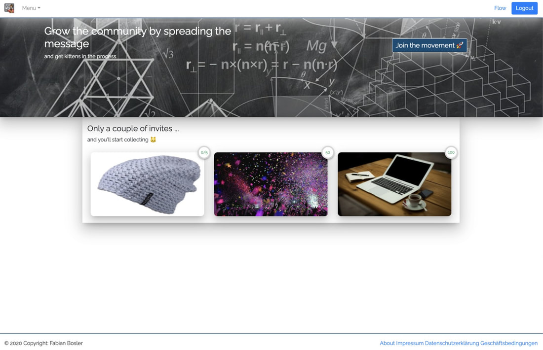
Before:
The design below was an initial prototype of the page before any design work had been put in place, such as colour scheme, layout, logo, etc.

Logo Design
A logo design wasn't in the original brief, but when I started planning the landing page it really felt like a logo was needed.
So, using Google Slides, I mocked this up in less than 1 minute (30 seconds was looking for the √ symbol).
Thankfully, the client was very happy with the logo design and decided to adopt it, formally.

Landing Page Design
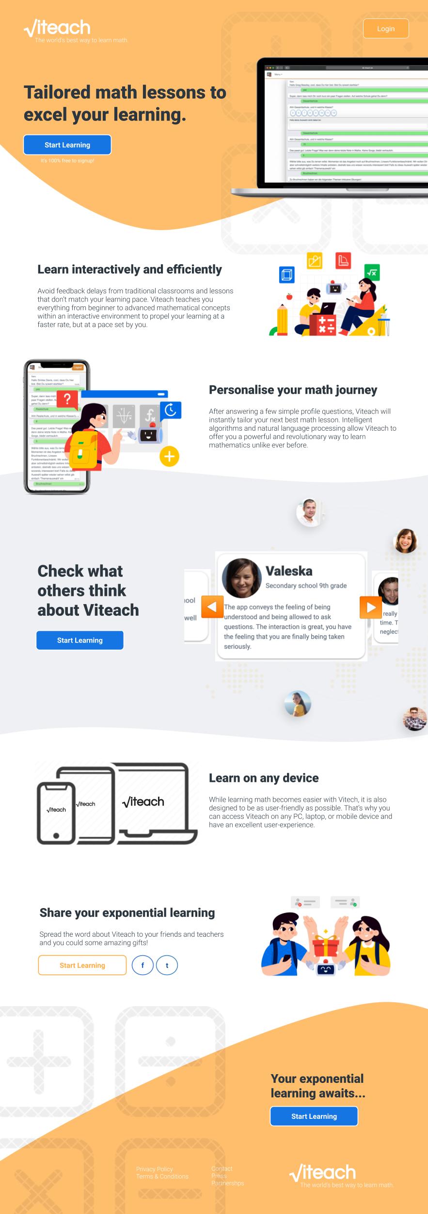
Here's the finished product of the homepage/landing page design for viteach.de. This design took me a few hours to make, but I was quite happy with how it turned out - as was the client.

See it live!
As I'm writing this, the website is still evolving as the product improves, but you can see there is a massive difference (and improvement) from where the page started to where it is now.
Lastly, if you're looking to brush up on your mathematic skills or know of any school kids or teachers who could benefit from a tool like Viteach, then check out their website. It's completely free - simply register/sign in with your email or Social Media accounts.
What did you think about using Google Slides as a design tool? Have you ever thought of using it like this?
Let me know in the comments below.
